Python is a cool language when it comes to machine learning.
Data visualization is the keys to building best machine learning model. And Without data visualization machine learning is just a waste of time data visualization helps us understand data and relationships between features.
Here we will learn which are the best plots to visualize what type of data.
Data is basically of two two types---
1.Numeric
2.Categorical
1. Draw distribution for single feature --
- If the feature is of categorical type then its better to use bar plots. in diagram given below you can see the different company names that produces automobiles these company names are categorical and graph shows which company manufactured how many autos
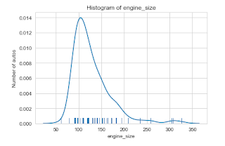
- if the feature is numerical then there are two more things we can do to get more views. first is using kde plot(kernel density estimate plot).and the other is using kde and histogram at same time. now look the fig given below you may find similarities with above histogram its because the are just different representations of same data. given below is example kde plot area under that curve is 1 if we take integration.
- 2D plots help us understand relationship between two features . specially between feature and labels.in this case we plot one feature on one axis say on x axis and other on y axis . below in diagram you will find there are two features engine size and price of the auto there we can see relation that as the size of engine increases price of the automobile increases. observe there is to much overlapping of points is going on at engine size approximately 100 or 90.we cant clearly see the points. to deal with this problem we use 3 techniques as following
- To find relation between categorical and numeric data its better to use box plot as it shows more precisely the relation between different categories and of same column against some other numeric column data. observe how well you can distinguish different categories of number of cylinders. in box plot box shows interquartile range mid line between box determines median outer line called Vickers
- There is also one more way to do this is using violin plot. like i said earlier it just another view of same data.


Comments
Post a Comment